
Types of charts in technical analysis: One of the keys to continual success in technical analysis is being able to identify where security is heading in the future. However, technical analysis cannot be performed without access to historical stock charts.
They are a graphical depiction of historical prices, volumes, and time periods that help individuals make informed decisions in the market. In this article, we will be discussing the various types of charts in technical analysis that individuals can use in the market.
Types Of Charts In Technical Analysis
The following are the types of charts in technical analysis that you can use to view the prices of securities:
Line Chart

The line chart is the simplest form of chart available to individuals in the stock market. It consists of only a single line that is formed by connecting the closing price of the security for the timeframe selected.
As it constitutes only a single line, it reduces the noise from the securities due to the fluctuations that might occur within the time frame selected. it gives individuals a broad overview of the historical and current direction of the market.
Due to its simplicity, this chart is ideal for individuals new to the stock market. It can help them get a grasp of the basic skills required to read charts before they can proceed to learn more advanced techniques.
At the same time, as the information provided by the line charts is limited to the closing price of the security, individuals who trade will not have enough information to formulate a trading strategy.
Bar Chart

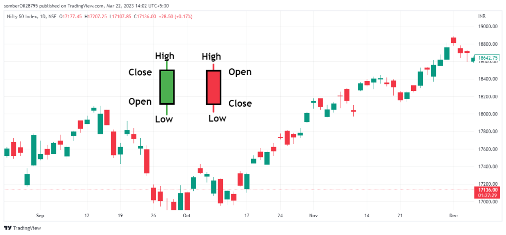
The bar chart also referred to as the OHLC chart is a type of chart that comprises a series of vertical lines that indicates the price range for a specified period of time.
A single price range in this chart consists of a vertical line and two small horizontal lines that extend toward the left and right.
Here, the height of the vertical line represents the range in which the security has moved for the specified period. The top point of the vertical line is the high price and the bottom point is the low price of the security for the specified period.
The horizontal line on the bar represents the opening and closing of the security for the specified period. Here, the line pointing toward the left indicates the opening price and the line pointing toward the right is the closing price.
If the price of the security rises over the specified time period, the line towards the right will close higher than the line towards the left and the bar will be green in color.
If the price of the security decreases over the specified time period, the line towards the left will close higher than the line towards the right and the bar will be red in color.
Candlestick Charts
The candlestick charts which originate their roots in japan are what most individuals involved in technical analysis commonly use. It derives its specified name because the components of the chart that indicate the price of the security look like a candlestick.
A single candlestick has three main components which make it complete, that is the body, the wicks, and the color.
Here, the size of the candle represents the range within which the security has opened and closed during the specific time period. The wick on the top of the candle represents the high security reached, and the lower wick represents the low security reached during the specified period.
If the closing price of the security is higher than the opening price, the candlestick will be green in color and the candlestick will be colored red if the closing price is lesser than the opening price of the security.
Over the course of time, these candlesticks have been named and divided into different categories based on their characteristics and individuals use these patterns to trade in the financial market.
Heikin Ashi Charts

The Heikin Ashi chart is another type of chart that originates from japan. The Heikin Ashi in Japanese means an “average bar” and it is named so because this chart uses the averages of the prices to show the movement of a security.
As it uses the averages of the security prices to form the bars, it is able to show the uptrend and the downtrends more clearly. This helps individuals to take better-informed decisions on when to enter or exit a trade.
Just like the candlesticks chart, the Heikin Ashi bar consists of a body, and wicks and is colored green or red. The wicks represent the highest or the lowest price of the security and the color of the candle tells us if the security has closed higher or lower than the opening price for the specified time period.
While the wicks and the colors represent the same data in the candlestick and Heikin Ashi chart, there is a variation in the data represented in the body of Heikin Ashi.
In the body of the Heikin Ashi candle, the opening price is derived from the midpoint of the previous candle, and the closing price is derived from the average of the open, high, low, and closing prices of a security during the current session.
This makes the charts appear smoother and individuals can easily identify the trends in the market.
Renko Charts
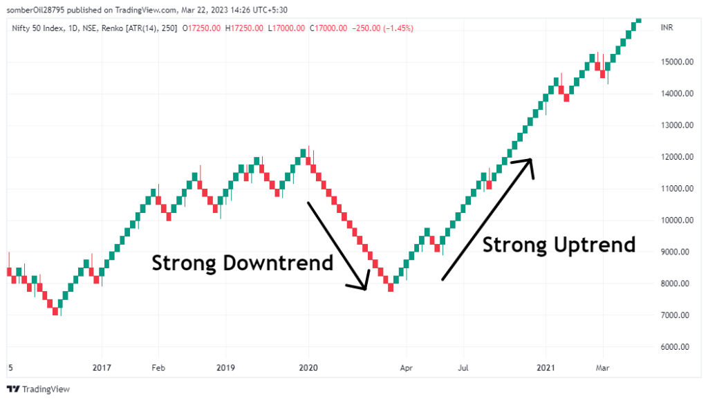
The word ‘Renko’ is derived from the Japanese word ‘Renga’ which means bricks. While the previously mentioned charts are based on both price and a standardized time interval, the Renko chart only takes price movements into consideration.
This chart creates bricks only when the security moves by a specified amount and thus eliminates the factor of time. In this chart, the size of the bricks can be modified according to the preference of the individuals.
If the price of security is rising, the bricks will be green in color and the bricks will be colored red when the price of a security is falling. It is also important to note that, the chart will depict a better trend when the price range of the bricks is larger in size.
This chart is designed to filter out the minor movements in the prices which makes it a lot easier for individuals to identify the trends. But on the downside, the price information will be lost due to this.
Point And Figure Charts
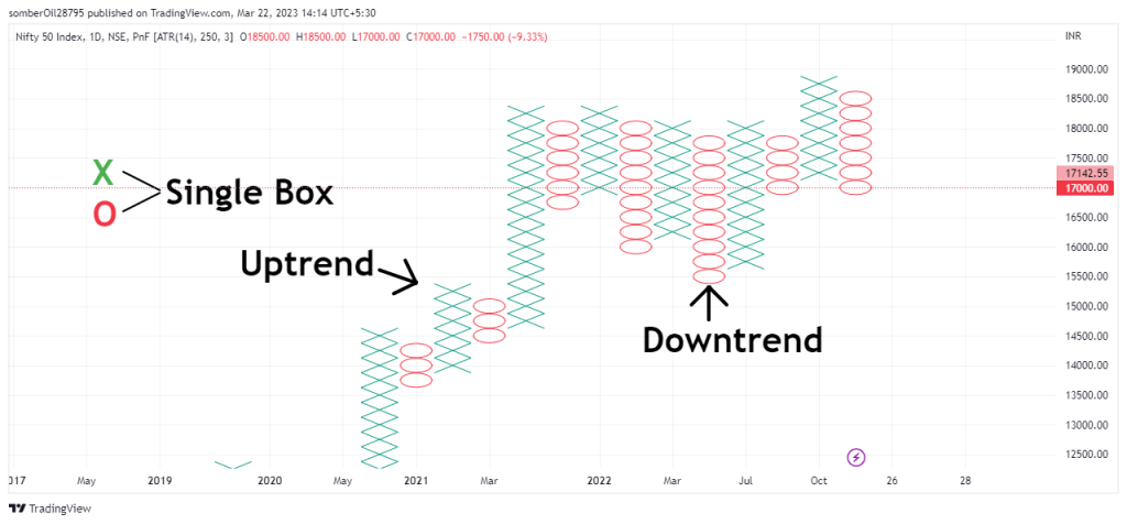
Point-and-figure chart of the oldest tools used in trading. Like the Renko Chart, the P&F Charts only focus on price movements and do not consider the time factor.
Point and Figure charts are made up of columns of Xs and Os representing filtered price changes. Rising prices are represented by X-Column while falling prices are represented by O-Columns.
The change in this chart occurs only when the security has moved as per the specified amount. Each X and O box in the X and O column represents the specific move in the price of the security that has been set by the individuals. The box size can be set to be a fixed value or a percentage of the current value of the security.
This chart can help individuals easily determine the support and resistance levels and also help them in drawing trendlines.
Also Read: 8 Best Books For Intraday Trading – Top Reads For Beginners!
In Closing
In this article, we covered the various types of charts in technical analysis and briefly explained how they are formed.
These chart patterns have their own utility and the type of chart you use depends upon the preference of the individuals and the strategies they use. But it is advantageous to have a general understanding of the alternatives available for assessing security price.
Tags: What are the 3 charts under technical analysis?, Which type of chart is best for trading?, Which chart is best for technical analysis?, Chart patterns in technical analysis, Types of technical analysis, Types of chart patterns, Types of charts in stock market, Line chart in technical analysis, Types Of Charts In Technical Analysis, What are Technical Stock Charts & their Types